After a difficult spring and summer, many venues across the World are opening up their doors and welcoming business again. Disney World re-opened all of their amusement parks mid-July, lock down ending in UK and India is encouraging shoppers to malls again, and many countries, such as Finland, are lifting their remote work recommendations from August onward. Traffic across cities and in public venues is on the rise, but COVID-19 is leaving long-standing effects to how people move in venues.
Limitations on maximum visitor numbers and travel restrictions have been implemented to secure consumers and staff; but they are also causing surprising effects. Some venues are even experiencing visitor peaks due to push for local tourism, which has caused larger-than-usual visitor numbers and long lines. Entry limits to individual shops, on the other hand, has increased the number of people queuing in shopping center corridors, waiting for their opportunity to enter. Just knowing the total number of visitors in your premises is not enough. In order to ensure safety and comfort of visitors, being able to grasp the details of people flow throughout your premises and over the course of a day is a necessity in many sectors.
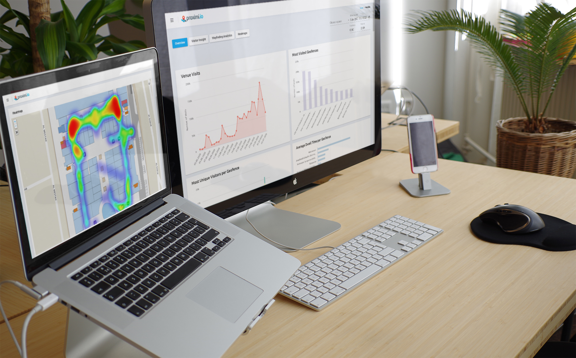
Due to demand from our customers, which include popular attractions, such as Dyreparken zoo, Moomin World theme park, Tawar Mall shopping centre and multiple private office spaces around the world, we have been working on new, improved analytics views. Here is an introduction of the the new Proximi.io analytics capabilities – and a summary of the previously existing ones:
Venue-level visitor numbers
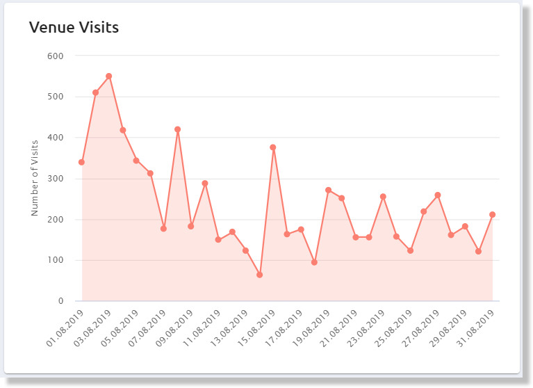 The total visit view gives you the first glimpse of what is happening at your venue. By selecting different time ranges you can either see the number of visitors per day – or compare entire months to each other.
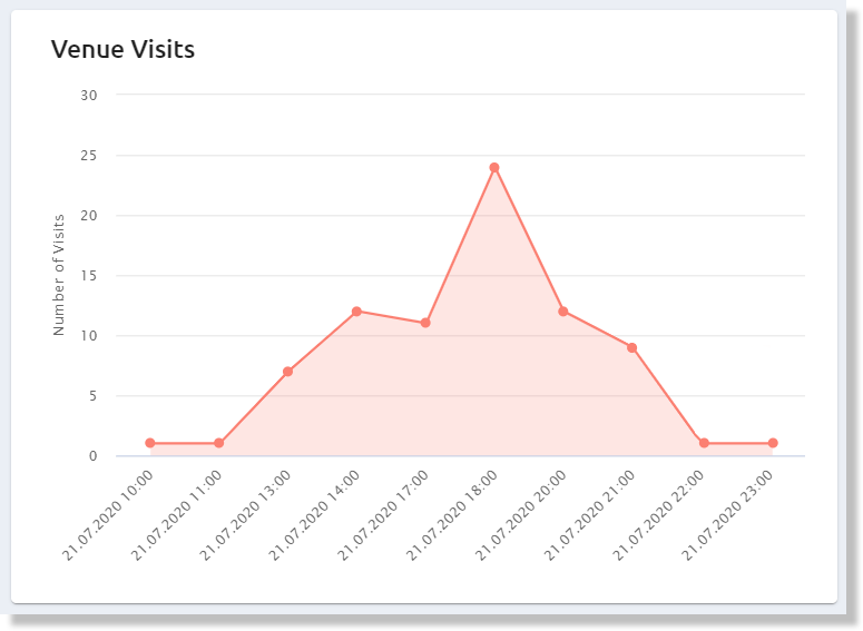 When you zoom into a single day, you can see the changes in traffic throughout a day. You will start identifying rush hours and periods of slower traffic.
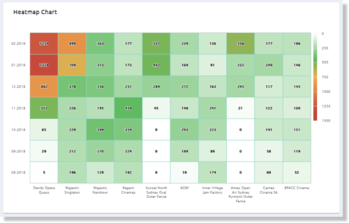 The heatmap chart allows you to easily compare different dates and and venues in a single visual graph.
Geofence-level visits
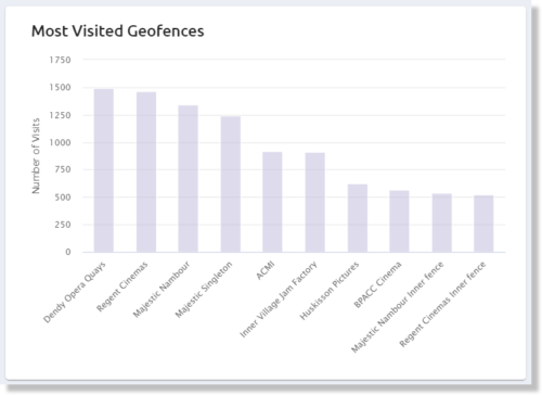 In order to grasp in more detail what is happening at your venue, you can divide the area into multiple geofences. Geofences can overlap each other, and larger geofences can contain smaller ones. This allows you to for example specify a higher-level geofence “food court”, and then further divide that into smaller geofences for each of the individual restaurants in the area.
Heatmaps

Heatmaps reveal a whole new point-of-view to the people flow at your venue. During the past weeks, we have reworked the heatmap visualization on the Proximi.io portal to give you much more granular views. Zoom in to see movement on specific corridors and pathways or zoom out to see the people flow around your venue.
As the heatmap is formed from the total position updates received from all of your visitors, it is a good tool for identifying bottlenecks and queues. The red areas are the locations, where you have heavy traffic. In other words, there are either a large number of people walking through this area, or people stand in lines waiting arount this part of your venue. These areas might need some extra attention in terms of placing extra barriers to help people maintain social distances or the introduction of unidirectional walkways. You might even want to implement alternative routing that avoids these congested areas, or encourage people to e.g. purchase tickets beforehand to avoid long queues at the venue entrance. Areas with heavy people flow are also the places, where you would want to maximize your cleaning efforts and place extra hand sanitizer in.
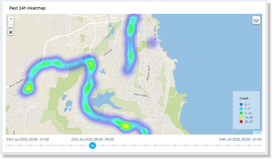
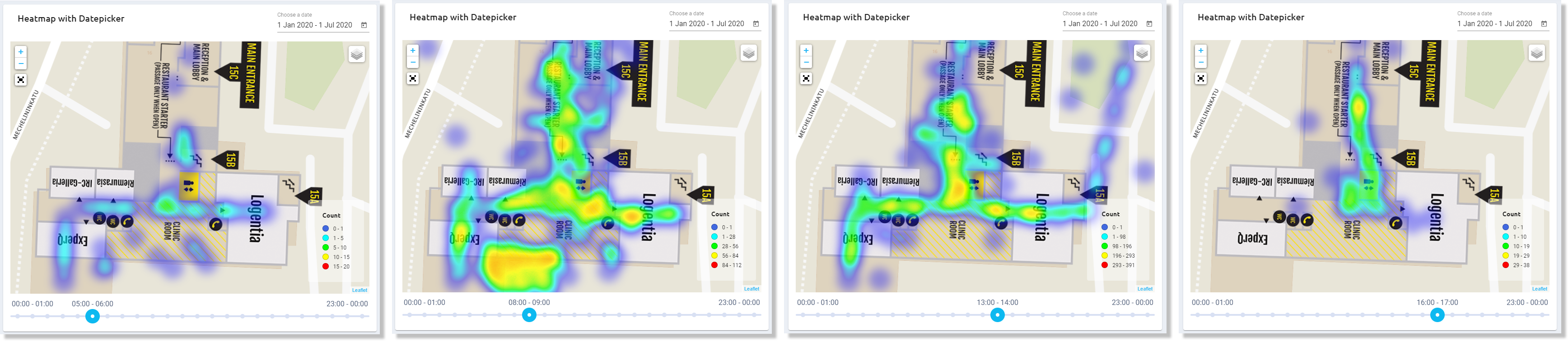 There is also a new heatmap that allows you to peek into the people flow during a single day or an average day during a longer period. You can browse through a day hour-by-hour, and see clearly where the bottlenecks at different times are. This view helps you to identify for example if you should introduce staggered entry or lunch times.
Alternatively, the heatmap helps you to identify quiet locations, where you could encourage more people to visit. Through real-time targeted messages at the busiest locations, you could encourage visitors to take a look at other attractions before coming back to the main sight at a quieter time. Those visitors, who would like to avoid crowds altogether, could even prefer only visiting the locations with least people flow.
Unique visitors map
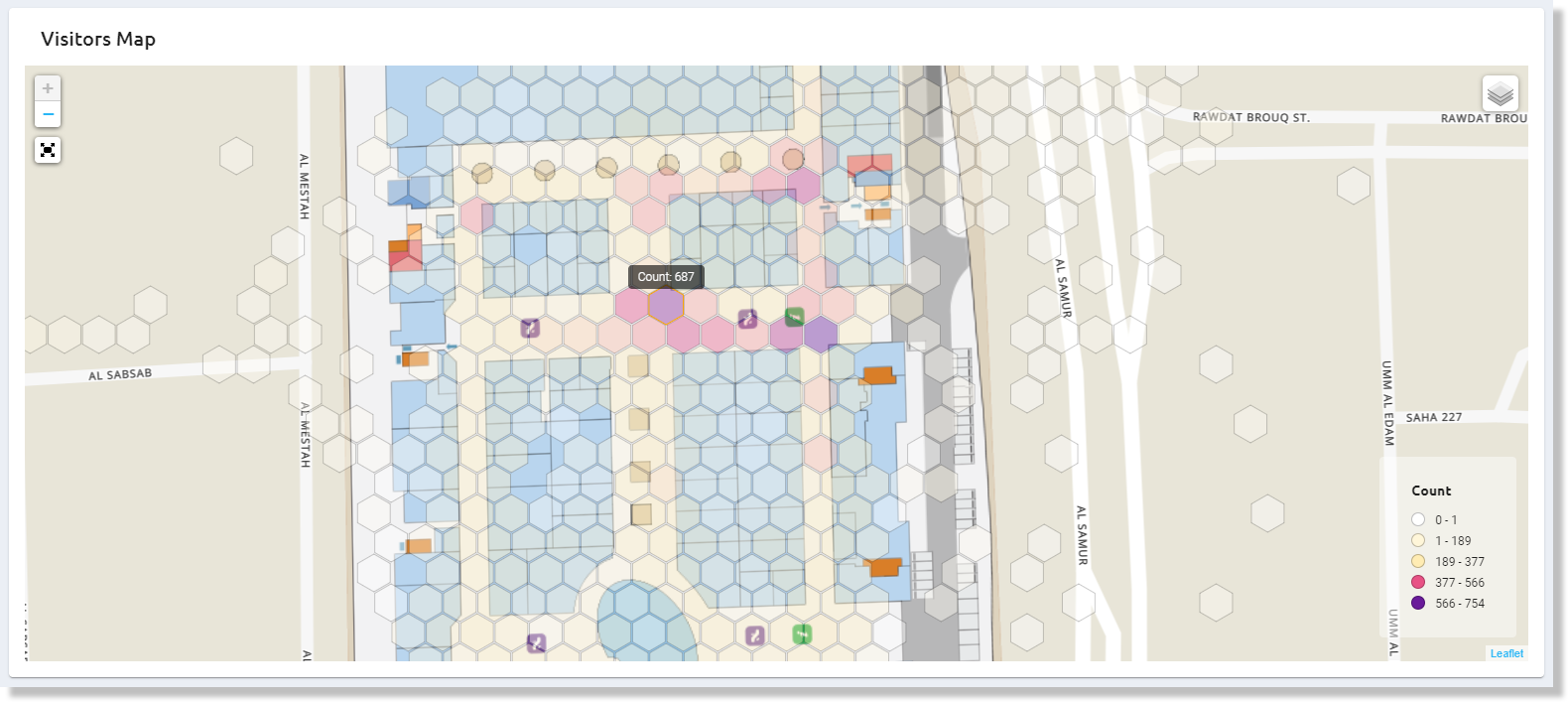
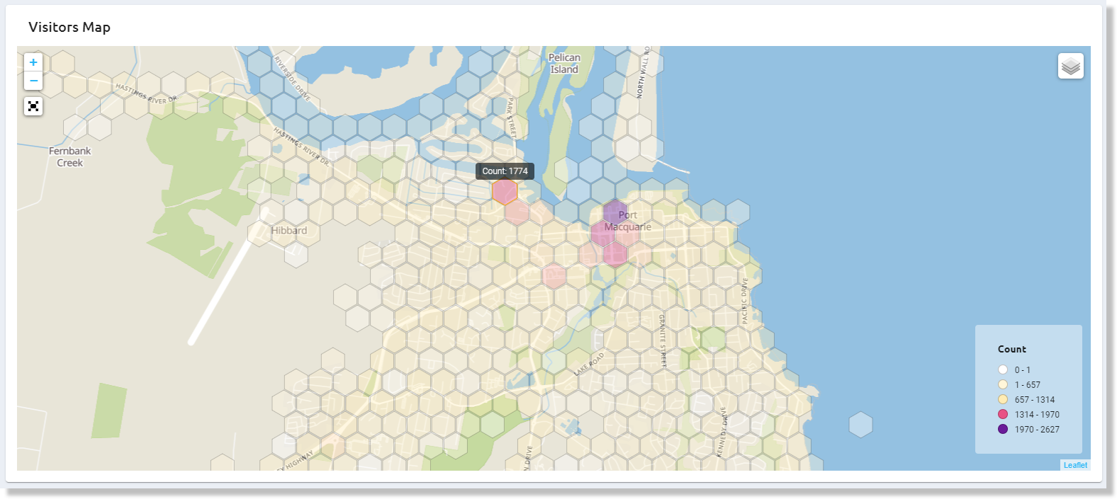 In order to grasp the number of individual visitors in different parts of the venue, we have added a grid view visualizing the unique visitors across your site. You can zoom in and out for different granularity levels, and select the data and time period as preferred. Hoover your mouse over a specific grid cell to see the exact visitor count there. This view is your best tool for identifying, if you have an even visitor spread across the venue – and consequently, how well visitors are able to maintain social distances. Similarly as with the heatmap, read areas are the ones that call for special attention and measures.
Real-time view
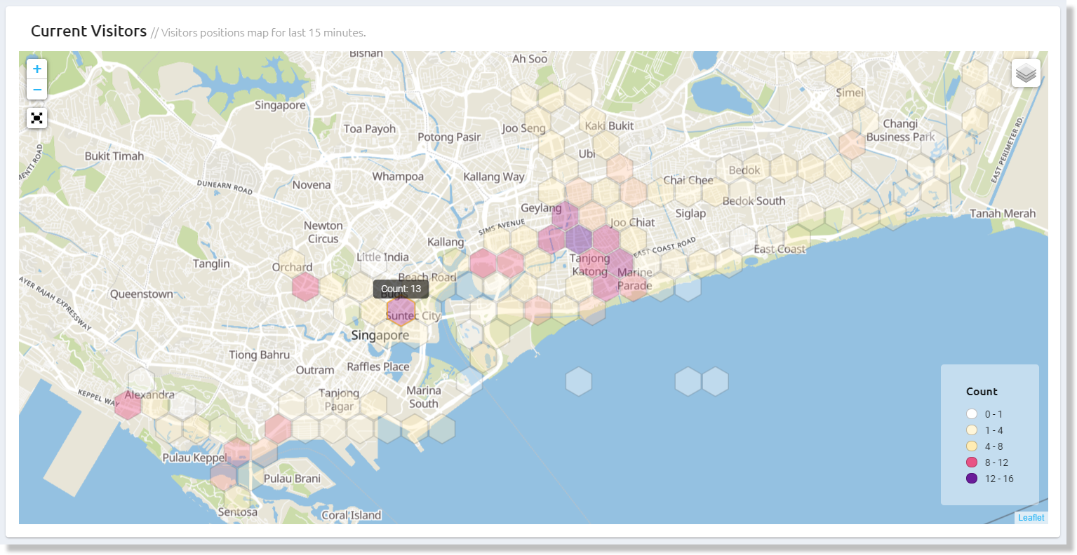 We have even added a real-time visitor view. You can find that as the first thing on the Dashboard after logging in to your account. This is a great tool for large and very busy venues. The view shows you the latest status of individual visitors at your site. The data updates constantly, but in order to get a realistic presentation, it agglomerates data from the last 15 minutes. This view allows you to react to large bottlenecks immediately, if needed.
How to start collecting analytics from your venue?
If you are an existing Proximi.io customer, you don’t need to make any changes to get access to these analytics. You can just login to your portal to see these analytics views. Historical data is also compatible with the visualizations. Additionally, the data is available via REST APIs for integrations to your own dashboards or big data analytics tools.
If you are not yet utilizing the Proximi.io platform, starting to collect location-based data is simple. The Proximi.io positioning SDK is a library that integrates to your existing mobile application. The seamless indoor-outdoor positioning logic utilizes a mix of technologies to locate your users, such as GPS, WiFi, Bluetooth and inertial sensors. The data is collected and transmitted to cloud via mobiles, and requires typically only a light Bluetooth installation (recommend for indoor areas and some outdoor areas). All data collection happens naturally in a GDPR-compatible manner.
Positioning and analytics can also be seamlessly integrated to Proximi.io maps and navigation components. Read more about Proximi.io for malls, amusement parks and offices.